Scopic Creative
Scopic Creative
  • hello.
  • our story.
  • ideas.
  • contact us.
  • 日本語.

ideas

We love sharing ideas that will grow your business globally.

scopic creative   |   never stop testing your website

9/7/2017

0 Comments

 
scopic mobile website design
As we have noted in previous articles on mobile website design, 2017 is the year that website mobility will really start to matter — if you want to provide a positive user experience for your audience.

So this is just a quick reminder — to make sure you regularly test your website is mobile-friendly.
​
Once your website is live (ideally during soft launch) and whenever you make changes to your website — test it — test it across various mobile devices, including smartphones/tablets of all shapes and sizes. Also — test it — across various operating systems like Windows, iOS and Android.

Test every page — test the menu and logo positioning, text formatting, image quality, button and input field location and sizing. Whenever you are testing your website, consider the target audience, or ideally ask a 3rd party to test it for you to gain a real understanding of the user-friendliness of your website.
 
Scopic works with businesses to create quality content that grabs attention and delivers a positive user experience, contact us to find out more.
0 Comments

scopic creative   |   5 basic points on going mobile-friendly

21/4/2017

0 Comments

 
Scopic Creative - Here are 5 basic points to consider when building your mobile website.
Over the past couple of years mobile-friendly websites have become a necessity due to the way people now consume content, but knowing where to start can be tough for traditional businesses.

​2017 is the year that accessibility, mobility and speed will really matter. Today, it is also essential that your website content is mobile-friendly-searchable to further improve your online visibility. 
 
Here are 5 basic points to consider when going mobile-friendly.
 
1. Quick and easy
A mobile website must be quick and easy to navigate. Mobile site users want to find information hassle free, so make things easy to find with clear buttons, icons and headings that guide and inform users. The less pinches, swipes and taps the better.
 
2. Short and simple
Users on mobile devices looking for products or services don't want to waste time, and really don't want to scroll, scroll, scroll through long paragraphs. Keep paragraph length to 3-5 lines. Use short, simple, targeted sentences that engage and help users find what they want. Sentence length should range from 10 – 20 words. Also, use keywords your target market uses to find what they are looking for.
 
3. Stay on message
Make sure your brand and communications (logo, colors, copy and style) are consistent across your desktop and mobile platforms. Brand consistency will ensure users develop familiarity with your business — familiarity breeds brand trust and loyalty.
 
4. Minimize input info
Mobile users are working on a small canvas, so limit the amount of information you require them to input when completing forms or purchase orders. Using drop downs instead of input fields will make things much easier. Also, make sure the input font size is readable at least 14 px.
 
5. Time to test
Once your mobile website is live — test it — across various mobile devices, including smartphones and tablets of all shapes and sizes. Also, make sure you test it across various operating systems like Windows, iOS and Android. Finally, when ready to go live, test your page speed with Google PageSpeed Insights.
 
Scopic works with you to build your business exposure online, contact us to find out more.
0 Comments

scopic creative  | minimalist web design

3/3/2017

0 Comments

 
Picture
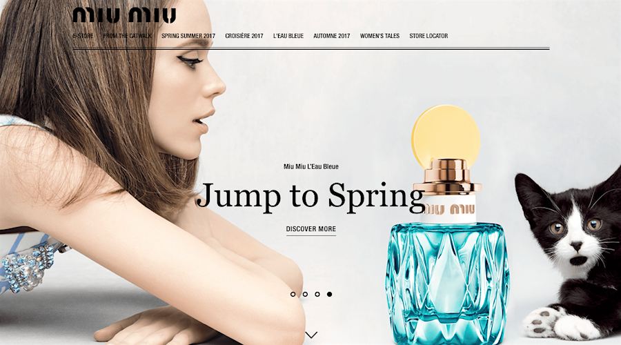
MUI MUI Japan embraces minimalistic elements.
Simple backgrounds, basic colors, powerful images and the positive use of negative space will continue to dominate web design in 2017. 

So, consider implementing these three minimalist web design basics to make sure you are creating a positive user experience for your visitors.
 
Focus on simplicity
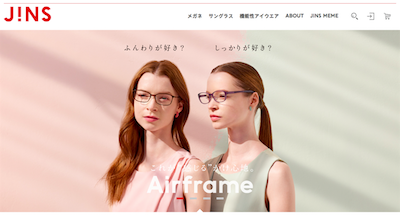
An effective website is structured on a minimalist approach to visual communications. Minimalist websites are built around the concept that less is always more, and always better. This means that minimalist website design purely focuses on the necessary and essential elements required to effectively communicate. This way any clutter or distracting visuals that may increase complexity are cut. How minimal you go, will depend on the purpose of your website, your target audience, and of course your business. 
JINS website Japan focuses on simplicity.
JINS Japan focuses on simplicity.
Maximise negative/white space
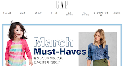
Minimalist websites maximize negative (or white space, but it does not have to be white). Negative space is the space on your website where there is no element placed. Using a white background on a minimalist website increases the negative space and pulls visitor attention to the dominant content. Creating space around images, clearly separating paragraphs and isolating important content guarantee visual communications are easily absorbed by visitors. Sparingly utilizing negative space will reduce unwanted interference and improve the overall user experience.
GAP website Japan maximises negative space.
GAP Japan maximises negative space.
Minimize color palate
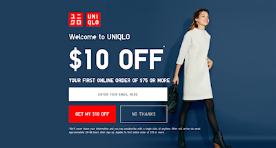
Color plays a powerful role in the visual communications of your website and is a central element of your brand's visual identity. While it is not the only element, it is most definitely one of the first things absorbed and possibly one of the most remembered by visitors in relation to your brand. Minimal use of colors (no more than two or three core colors that are associated with your brand) will add clarity, improve navigation, increase accessibility and reinforce your brand's visual identity. Taking the time to carefully consider your website color palate will also reinforce your brand experience for visitors.
Uniqlo website Japan minimizes color palate.
Uniqlo Japan minimizes color palate.
Finally, remember you only have one or two seconds to entice your visitors and have them engage with your website. Creating a clean, crisp, minimal website will allow you to communicate more efficiently and effectively --- it is that simple.

Scopic works with businesses to create an enhanced user experience for website visitors, contact us to find out more.
0 Comments

scopic creative   |   SEO tips for 2017

23/11/2016

 
SEO Business Strategy Meeting
With major search engines Google, Bing and Yahoo frequently revising their algorithms, the techniques to maximizing your websites search engine optimization (SEO) may seem complex and expensive. So, here are some simple tips to consider in 2016 that will positively impact your websites organic search ranking in 2017.
 
Keywords count
Identify keywords/phrases your target audience may use when searching and then use these keywords/phrases through your landing page, linked webpages or blog posts.
 
As 75% of search engine “search phrases” are three and five words in length, it makes good sense to use a similar pattern when creating page headings and sub-headings. Through the body of your copy it is important to also use related “keyword” words/phrases. This will ensure that your content is viewed as authentic and valuable by search engines. An interesting point here is that the number of voice searches continues to grow and is already impacting on search trends on mobile devices. In 2017 and beyond voice search will greatly impact future SEO techniques.
 
Remember, in order to catch and keep the attention of search engines like Google, Bing and Yahoo you must be regularly updating your website content. Scheduled content audits and adding a latest news or product updates page will play an important role in your websites organic ranking over the long-term.
 
Visuals engage
As speeds increase and mobile device usage grows people are wanting more than just words. Research shows images and videos perform much better than just words on a screen as they are more appealing to people.
 
Make sure that images and videos on your website also use keywords/phrases in the heading/caption and in the alt tag. Alt tag is basically an abbreviation of “alternative attributes of an image tag”. Alt tags play a vital role for search engines as they provide a descriptive explanation of images for the search-bots that crawl and rank your website.
 
It may take time to search for or create the right image/video, but your audience will like you for it and may even share it on social media. Remember, if you do use images or videos make sure they add value to your content and are always of a highest quality.
 
Mobile-friendly matters
Today, more people are reading/watching news on mobile devices, so it is essential that your website content is mobile-friendly-searchable to further improve your online visibility.
 
Mobile site users want to find information quickly and easily, so make the user experience stress-free with clear buttons, headings and icons that guide and inform users. The less people have to wait, pinch and swipe the better.
 
Google started mobile-first indexing in 2016, this basically and importantly means that Google are indexing mobile versions of websites before desktop versions. So, 2017 will be the year that mobility and speed matters, as it is no secret that a positive user experience correlates with fast mobile device page loading speeds. A simple step to increase your website loading speed, is to compress/reduce your images and videos to ensure you catch and hold the attention of visitors.
 
Stay relevant
Finally, as mentioned earlier, search engines (Google, Bing, Yahoo) continually revise their algorithms, so as to provide a better search experience for users and improve SERPs (search engine results pages).
 
What may have worked a few years ago, no longer works as effectively today. In an increasingly changing, competitive and mobile marketplace, remember to make sure your content is fresh, fast and authentic.
 
Remember, to continually get the best SEO results you really need to follow the most relevant trends. Currently, the richer the mobile content, the higher the SERPs ranking – this is good for business.
 
Scopic works with you to create rich content to grow your organic search ranking, contact us to find out more.
Photo Credit: Shutterstock

Scopic Creative   |   5 Simple Rules for a Successful Mobile Friendly Website 

29/1/2016

 
Picture
In 2015 mobile Internet usage continued to skyrocket and 2016 looks no different.
 
According to a white paper by commScore Digital Future in Focus over the past 4 years “smartphone usage is up 394 percent, and tablet usage is up a whopping 1,721 percent as these platforms now combine to account for 60 percent of digital media time spent.”
 
Read the report: 2015 U.S. Digital Future in Focus

Mobile-only Internet usage is becoming the norm, so 2016 is a your time to go mobile.  
 
Here are 5 simple rules to consider before creating your mobile website.
 
1. Quick and easy
A mobile website must be quick and easy to navigate. Mobile site users want to find information hassle free, so make things easy to find with clear buttons, icons and headings that guide and inform users. The less pinches, swipes and taps the better.
 
2. Short and simple
Users on mobile devices looking for products or services don't want to waste time, and really don't want to scroll, scroll, scroll through long paragraphs. Keep paragraph length to 2-4 lines. Use short, simple, targeted sentences that engage and help users find what they want. Sentence length should range from 10 – 30 words.
 
3. Minimize input info
Mobile users are working on a small canvas, so limit the amount of information you require them to tap in. Using drop downs instead of input fields will make things much easier. Also, make sure the input font size is readable at least 14 px.
 
4. Stay on message
Make sure your brand and communications (logo, colors, copy and style) are consistent across your desktop and mobile platforms. Brand consistency will ensure users develop familiarity with your business, and with familiarity comes brand trust and loyalty.
 
5. Time to test
Once your mobile website is live test it on mobile devices, including smartphones and tablets of all shapes and sizes. Also, make sure you test it across various operating systems like Windows, iOS and Android. Finally, check your page speed with Google PageSpeed Insights.
 
Scopic helps you build your global audience through creative communications, contact us to find out more.
Photo Credit: Shutterstock

Nielsen  |  The science of consumer spending and neuroscience

16/5/2013

 
Picture
Nielsen a global leader in consumer measurement and information is offering big retailers eye tracking technology to better understand shopping patterns.
If you are a small business that can't afford this big technology then we suggest you get online with a mobile friendly website that engages customers via social media.

Watch the story: Shopping and science

Interested in finding out how we could help your business persuasively communicate, then contact us to find out more.

Scopic Creative   |   Hello!

9/1/2012

0 Comments

 
Scopic Creative Communication (Scopic) is an independent Japan-based communications and marketing agency specializing in generating creative solutions.
Scopic Creative is a communications and marketing agency that moves people.

Connect with us by email, Skype or simply send us a message.

If you like what you see and are interested in finding out more, then connect with us via email, Skype or fill out your details and we’ll get back to you on the same business day.

General Enquiry
hello@scopiccommunication.com
​
Skype Name
​scopiccommunication.com

If you're an existing client please use the emails below and we’ll get back to you on the same business day.

Communications and Marketing Job
admin@scopiccommunication.com

Copywriting Job
editor@scopiccommunication.com

Account Enquiry
accounts@scopiccommunication.com

Like us on Facebook facebook.com/ScopicCreative
Follow us on Twitter twitter.com/ScopicCreative

​
Created on June 1, 2011
In submitting an online query to us, you agree that we may use your personal information to respond to your query with the contact details you provide. We won’t use or disclose that personal information for any other purpose.
0 Comments
    Scopic Creative Communication creative branding and marketing ideas.

    topic.

    All
    マーケティング
    コミュニケーション
    ブランド・アイデンティティ
    ブランド・コミュニケーション
    アウトソーシング・ズソリューション
    ビジネス・プロセス・アウトソーシング
    Advertising
    Brand Development
    Brand Identity
    Branding
    Brand Management
    Charity Work
    Communications
    Content Marketing
    Corporate Identity
    Influencers
    International Marketing
    Marketing
    Mobile Website
    Press Releases
    SEO
    Social Media
    Thank You!
    Visual Identity
    Website Copy
    Website Development

    date.

    May 2020
    January 2020
    December 2019
    November 2019
    August 2019
    July 2019
    May 2019
    March 2019
    January 2019
    December 2018
    November 2018
    September 2018
    August 2018
    July 2018
    May 2018
    March 2018
    February 2018
    December 2017
    November 2017
    October 2017
    September 2017
    August 2017
    July 2017
    June 2017
    May 2017
    April 2017
    March 2017
    February 2017
    January 2017
    December 2016
    November 2016
    October 2016
    September 2016
    August 2016
    July 2016
    June 2016
    May 2016
    April 2016
    March 2016
    February 2016
    January 2016
    December 2015
    November 2015
    October 2015
    September 2015
    August 2015
    July 2015
    June 2015
    May 2015
    April 2015
    March 2015
    February 2015
    January 2015
    December 2014
    November 2014
    October 2014
    May 2014
    March 2014
    December 2013
    November 2013
    September 2013
    August 2013
    July 2013
    June 2013
    May 2013
    April 2013
    March 2013
    February 2013
    December 2012
    November 2012
    September 2012
    August 2012
    July 2012
    June 2012
    April 2012
    March 2012
    February 2012
    January 2012

QUICK LINKS.
Hello
Our Story
How We Work
Ideas
Contact Us
日本語
USEFUL INFO. 
Pricing
Terms of Service
Conditions of Use

CREATIVE.
Advertisements
Brand Development
Brand Identity
Graphic Design
Social Media Strategy
Website Development
COMMUNICATION.
Brand Loc­al­iza­tion
Internal Communications
Influencer Marketing

Marketing Collateral
Press Releases
Website Copy

WHO WE ARE.
Scopic Creative an independent communications and marketing consultancy. 
福岡市日本のマーケティングコンサルタント。

JAPAN  |  PHILIPPINES  |  AUSTRALIA
Copyright © 2011 - 2021
All Rights Reserved.


scopic-creative-facebook
Picture