
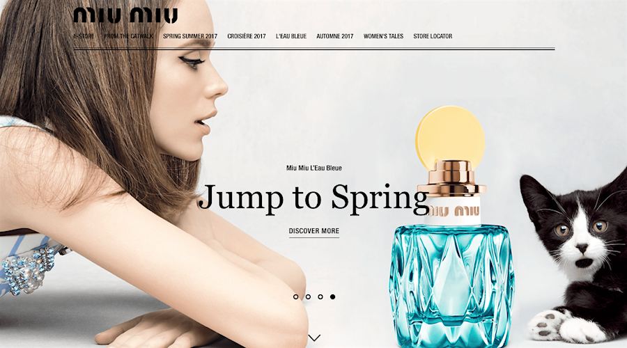
MUI MUI Japan embraces minimalistic elements.
Simple backgrounds, basic colors, powerful images and the positive use of negative space will continue to dominate web design in 2017.
So, consider implementing these three minimalist web design basics to make sure you are creating a positive user experience for your visitors.
Focus on simplicity
An effective website is structured on a minimalist approach to visual communications. Minimalist websites are built around the concept that less is always more, and always better. This means that minimalist website design purely focuses on the necessary and essential elements required to effectively communicate. This way any clutter or distracting visuals that may increase complexity are cut. How minimal you go, will depend on the purpose of your website, your target audience, and of course your business.
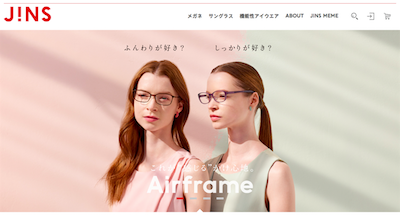
JINS Japan focuses on simplicity.
Maximise negative/white space
Minimalist websites maximize negative (or white space, but it does not have to be white). Negative space is the space on your website where there is no element placed. Using a white background on a minimalist website increases the negative space and pulls visitor attention to the dominant content. Creating space around images, clearly separating paragraphs and isolating important content guarantee visual communications are easily absorbed by visitors. Sparingly utilizing negative space will reduce unwanted interference and improve the overall user experience.
Minimalist websites maximize negative (or white space, but it does not have to be white). Negative space is the space on your website where there is no element placed. Using a white background on a minimalist website increases the negative space and pulls visitor attention to the dominant content. Creating space around images, clearly separating paragraphs and isolating important content guarantee visual communications are easily absorbed by visitors. Sparingly utilizing negative space will reduce unwanted interference and improve the overall user experience.
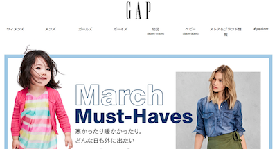
GAP Japan maximises negative space.
Minimize color palate
Color plays a powerful role in the visual communications of your website and is a central element of your brand's visual identity. While it is not the only element, it is most definitely one of the first things absorbed and possibly one of the most remembered by visitors in relation to your brand. Minimal use of colors (no more than two or three core colors that are associated with your brand) will add clarity, improve navigation, increase accessibility and reinforce your brand's visual identity. Taking the time to carefully consider your website color palate will also reinforce your brand experience for visitors.
Color plays a powerful role in the visual communications of your website and is a central element of your brand's visual identity. While it is not the only element, it is most definitely one of the first things absorbed and possibly one of the most remembered by visitors in relation to your brand. Minimal use of colors (no more than two or three core colors that are associated with your brand) will add clarity, improve navigation, increase accessibility and reinforce your brand's visual identity. Taking the time to carefully consider your website color palate will also reinforce your brand experience for visitors.
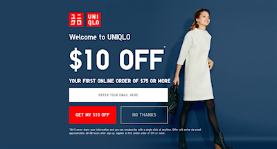
Uniqlo Japan minimizes color palate.
Finally, remember you only have one or two seconds to entice your visitors and have them engage with your website. Creating a clean, crisp, minimal website will allow you to communicate more efficiently and effectively --- it is that simple.
Scopic works with businesses to create an enhanced user experience for website visitors, contact us to find out more.
Scopic works with businesses to create an enhanced user experience for website visitors, contact us to find out more.