Scopic Creative
Scopic Creative
  • hello.
  • our story.
  • ideas.
  • contact us.
  • 日本語.

ideas

We love sharing ideas that will grow your business globally.

Scopic Creative   |   Impact of Color on Marketing

21/1/2019

0 Comments

 
Scopic Creative, The Impact of Color on Marketing
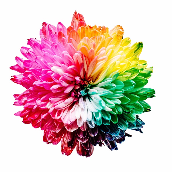
As visual creatures, color plays a huge role in influencing our behavior. I’m sure, many of you can remember grabbing the sprinkles, sugar strands, jimmies, or hundreds and thousands at birthday parties. Color is often the first thing that hits our senses and often leaves the most lasting and memorable impression.
 
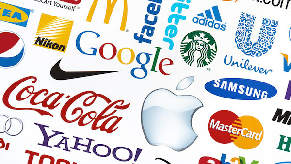
Research into the impact of color in marketing and color psychology, appropriately titled Impact of Color on Marketing and Color psychology: a critical review found that colors really do influence the moods and feelings (positively or negatively) of consumers. Research papers indicate that between 60-90 percent of product evaluation and product purchase is based on color alone. Additional research has also shown in The Interactive Effects of Colors and Products on Perceptions of Brand Logo Appropriateness a correctly chosen color mix for your business logo can bring immediate value to your brand.
 
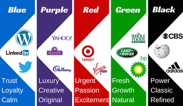
Basically, what do specific colors positively say to us?
  • Black – authority, elegance, powerful
  • White – cleanliness, purity, simplistic
  • Red – energetic, excitement, passion
  • Blue – loyalty, security, trust
  • Orange – confidence, friendliness, warmth
  • Yellow – happiness, intellect, optimism
  • Green – freshness, growth, health
  • Purple – wealth, wisdom, sophistication
  • Magenta – creativity, imaginative, innovative
 
Effective brands use color to great success to engage and connect with their audience. Before choosing the color mix for your logo, marketing materials, website or product range it is important to firstly consider some basic points:

Color is Memorable
Color is a central element of your visual identity. Carefully consider your visual identity color mix, as it acts like the personality of your business with your audience. While it is not the only element in your visual identity, it is definitely one of the first things seen and possibly the most memorable of your visual identity. 

Color is Innate
Find out the demographic breakdown of your audience and what color mix may persuade them to act. Defining who you are speaking to will greatly influence your color selection. Now you know your audience, you will be able to choose a color mix that positively influences your audience’s moods and feelings.

Consider the Competition
Check out your competition and consider how you can differentiate your brand and products from your competitors with color. This can be tough, as you will still need to connect with your audience and satisfy marketplace perceptions. A/B testing (split-run testing) of color options with your target audience will help you make an informed decision.

Consider the Platform
Be sure that whatever color mix you choose for your brand and products it can work online as well as in traditional print marketing. What looks great on a computer screen in RGB may not look so great on paper in CMYK. Also, carefully consider the color mix for your online messaging, active text and purchasing buttons, so to complement and at the same time stand out from the other content on the webpage.

Be Color Consistent
Your branding and visual identity needs to be consistent, clear and uncomplicated. When you try to do too much color, your messaging gets lost. By keeping things consistent and clear, you are keeping your visual communications strong and memorable. Color consistency will ensure your audience develops a visual connection and relationship with your brand's personality and products.
 
As mentioned, color is one of the most effective ways to communicate your brand and products to your audience. Color contributes not only to distinguishing your products from your competitors, but also influences consumer mood and feeling.

​Scopic works with businesses to build consumer engagement, connect with us to find out more.
0 Comments

scopic creative   |   choosing your brand’s color mix

10/6/2017

0 Comments

 
Picture
Color is one of the most effective ways to communicate your brand and products to your audience. Color contributes not only to distinguishing your products from your competitors, but also influences consumer mood and feeling.
 
Research into the impact of color in marketing, appropriately titled Impact of Color on Marketing found that colors really do influence the moods and feelings (positively or negatively) of consumers. This research paper indicated that between 60-90 percent of product evaluation and product purchase is based on color alone. Additional research has also shown in The Interactive Effects of Colors and Products on Perceptions of Brand Logo Appropriateness a correctly chosen color mix for your business logo can bring immediate value to your brand.
 
Effective brands use color to great success to engage and connect with their audience. Before even choosing the color mix for your logo, marketing materials, website or product range it is important to firstly consider some basic points:
 
1. Color is memorable
Color is a central element of your visual identity. Carefully consider your visual identity color mix, as it acts like the personality of your business with your audience. While it is not the only element in your visual identity, it is definitely one of the first things seen and possibly the most memorable of your visual identity. 
 
2. Color is innate
Find out the demographic breakdown of your audience and what color mix may persuade them to act. Defining who you are speaking to will greatly influence your color selection. Now you know your audience, you will be able to choose a color mix that positively influences your audience’s moods and feelings.
 
3. Consider the competition
Check out your competition and consider how you can differentiate your brand and products from your competitors with color. This can be tough, as you will still need to connect with your audience and satisfy marketplace perceptions. A/B testing (split-run testing) of color options with your target audience will help you make an informed decision.
 
4. Consider the platform
Be sure that whatever color mix you choose for your brand and products it can work online as well as in traditional print marketing. What looks great on a computer screen in RGB may not look so great on paper in CMYK. Also, carefully consider the color mix for your online messaging, active text and purchasing buttons, so to complement and at the same time stand out from the other content on the webpage.
 
5. Be consistent with color
Your branding and visual identity needs to be consistent, clear and uncomplicated. When you try to do too much color, your messaging gets lost. By keeping things consistent and clear, you are keeping your visual communications strong and memorable. Color consistency will ensure your audience develops a visual connection and relationship with your brand's personality and products. This will inevitable influence sales. 
 
​Scopic works with businesses to create strong and memorable brands, connect with us to find out more.
0 Comments

Scopic Creative   |   5 Brochure Design Ideas

21/8/2015

 
あなたの会社のマーケティングを全世界へ。 ブランディング ・ コミュニケーション ・ マーケティング。
1. Think creatively simple
Creatively simple cover designs cut through and connect. To grab the attention of your target audience, combine a powerful image with enticing text. Your brochure must firstly be picked up, before it will be flicked through.

2. Keep content crisp
Most target audiences are time poor, so now they are inside your brochure — keep them engaged. Use strong, clean headlines with quality text, but don’t over do it! Keep plenty of white space, it will help draw attention to your key points.

3. Make people act
The key purpose of your brochure should be to encourage people to act. Do you want people to click on your website? Pick up the phone? Send an email? Visit your office? A strong call to action tells your target audience exactly what to do next, so make sure it stands out on the page!

4. Reinforce your brand
The colors and images you use, the shape and size of images, the font type and message across your brochure must be consistent. Keeping your brand consistent will ensure your target audience develops a visual connection and relationship with your business.

5. Feel the quality
Finally, don’t try to save money with cheap paper stock. Use high-quality paper with a glossy finish to create a brochure that screams quality or a matte finish for a softer more subtle feel. The weight, texture and feel of your brochure are all part of creating a powerful brand image.

Scopic will look, listen and discover fresh solutions that will force people to want to engage with your brand, 
contact us to find out more.

Scopic Creative   |   5 Simple Visual Brand Identity Ideas

11/5/2015

 
Scopic Creative Communication five brand development ideas.
1. Do you know your audience?
Knowing and understanding your target audience is an essential element in creating a successful visual identity. Defining who you are speaking to will help you target your visual communications.

2. Do you know your colors?
Color is a central element of your visual identity. While it is not the only element in your visual identity, it is definitely one of the first things seen and possibly the most memorable of your visual identity. Carefully consider your visual identity color mix, as it will set the mood for your business.

3. Do you keep things simple?
Your visual identity needs to be simple and uncomplicated. When you try to do too much things get watered down. By keeping things simple you are keeping the visual communications strong, clear, and understandable.

4. Do you keep your visual communications consistent?
The colors and images you use, the shape and size of images, the font type and wording across your visual communications must be consistent. Keeping your brand consistent will ensure your target audience develops a visual connection and relationship with your business.

5. Do you really know your style?
The best way to know and maintain your visual brand identity is to create a style guide with exact specifications and guidelines. As mentioned earlier, to clearly communicate with your target audience in a consistent way you should always use the same colors, fonts, sizes, and image categories. 

Scopic works with you to create your visual brand identity, contact us to find out more.

Scopic Creative   |   Is color positively impacting on your branding?

10/4/2015

 
Scopic Creative Communication brand design and development ideas.
Color is one of the most effective ways to communicate your brand and services/products to your target audience. It may not be the only element in your brand’s visual identity, but it's definitely one of the first things seen and possibly the most memorable.

Research into the impact of color in marketing, conveniently titled Impact of color on marketing found that colors really do influence the moods and feelings (positively or negatively) of consumers. The research paper indicated that between 60‐90 percent of product evaluation is solely based on color use alone.

Good brands use color to great success to engage their target audience. Before even choosing the color mix for your logo, marketing materials, website or product range it is important to firstly consider some simple points:

1. Know your audience
Know the demographic breakdown of your target audience and what motivates them. Defining who you are speaking to will greatly influence your color selection and color balance. 

2. Analyze the competition
Check out your competition and consider how you can differentiate your offerings from your competitors. This can be tough, as you still need to align with your sector and at the same time stand out from others in the marketplace.

3. Consider media platforms
Be sure that whatever color mix you choose for your brand and business it can work online as well as in traditional print marketing. What looks great on a computer screen in RGB may not look so great on paper in CMYK. Start by asking yourself, does my logo work in black and white?

Take the time to carefully consider your color mix, as it will impact on your brand's visual identity. 

​
Scopic works with you from the start to create a strong and consistent brand identity, contact us to find out more.

Scopic Creative   |   Hello!

9/1/2012

0 Comments

 
Scopic Creative Communication (Scopic) is an independent Japan-based communications and marketing agency specializing in generating creative solutions.
Scopic Creative is a communications and marketing agency that moves people.

Connect with us by email, Skype or simply send us a message.

If you like what you see and are interested in finding out more, then connect with us via email, Skype or fill out your details and we’ll get back to you on the same business day.

General Enquiry
hello@scopiccommunication.com
​
Skype Name
​scopiccommunication.com

If you're an existing client please use the emails below and we’ll get back to you on the same business day.

Communications and Marketing Job
admin@scopiccommunication.com

Copywriting Job
editor@scopiccommunication.com

Account Enquiry
accounts@scopiccommunication.com

Like us on Facebook facebook.com/ScopicCreative
Follow us on Twitter twitter.com/ScopicCreative

​
Created on June 1, 2011
In submitting an online query to us, you agree that we may use your personal information to respond to your query with the contact details you provide. We won’t use or disclose that personal information for any other purpose.
0 Comments
    Scopic Creative Communication creative branding and marketing ideas.

    topic.

    All
    マーケティング
    コミュニケーション
    ブランド・アイデンティティ
    ブランド・コミュニケーション
    アウトソーシング・ズソリューション
    ビジネス・プロセス・アウトソーシング
    Advertising
    Brand Development
    Brand Identity
    Branding
    Brand Management
    Charity Work
    Communications
    Content Marketing
    Corporate Identity
    Influencers
    International Marketing
    Marketing
    Mobile Website
    Press Releases
    SEO
    Social Media
    Thank You!
    Visual Identity
    Website Copy
    Website Development

    date.

    May 2020
    January 2020
    December 2019
    November 2019
    August 2019
    July 2019
    May 2019
    March 2019
    January 2019
    December 2018
    November 2018
    September 2018
    August 2018
    July 2018
    May 2018
    March 2018
    February 2018
    December 2017
    November 2017
    October 2017
    September 2017
    August 2017
    July 2017
    June 2017
    May 2017
    April 2017
    March 2017
    February 2017
    January 2017
    December 2016
    November 2016
    October 2016
    September 2016
    August 2016
    July 2016
    June 2016
    May 2016
    April 2016
    March 2016
    February 2016
    January 2016
    December 2015
    November 2015
    October 2015
    September 2015
    August 2015
    July 2015
    June 2015
    May 2015
    April 2015
    March 2015
    February 2015
    January 2015
    December 2014
    November 2014
    October 2014
    May 2014
    March 2014
    December 2013
    November 2013
    September 2013
    August 2013
    July 2013
    June 2013
    May 2013
    April 2013
    March 2013
    February 2013
    December 2012
    November 2012
    September 2012
    August 2012
    July 2012
    June 2012
    April 2012
    March 2012
    February 2012
    January 2012

QUICK LINKS.
Hello
Our Story
How We Work
Ideas
Contact Us
日本語
USEFUL INFO. 
Pricing
Terms of Service
Conditions of Use

CREATIVE.
Advertisements
Brand Development
Brand Identity
Graphic Design
Social Media Strategy
Website Development
COMMUNICATION.
Brand Loc­al­iza­tion
Internal Communications
Influencer Marketing

Marketing Collateral
Press Releases
Website Copy

WHO WE ARE.
Scopic Creative an independent communications and marketing consultancy. 
福岡市日本のマーケティングコンサルタント。

JAPAN  |  PHILIPPINES  |  AUSTRALIA
Copyright © 2011 - 2021
All Rights Reserved.


scopic-creative-facebook
Picture